Your visual brand is more than just a logo on your homepage; it is an identifier for your website or business. Branding is the key to creating a lasting impression so visitors can relate to your personal story and shoppers can find your products. But how do you create a presence that people recognize?
Start with the visuals.
1. Create a Color Palette and Stick To It
Start with the visuals.
1. Create a Color Palette and Stick To It
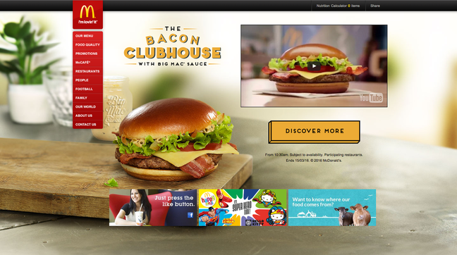
Some of the most iconic brands in the world – Coca-Cola, McDonald's, UPS – are identifiable by a single color. The thing that these companies all have in common is that they have a distinct color palette and they always use it.
It's a lesson that any website, of any size, can learn from. Every brand should have a unique color palette that includes one signature color and up to three hues. All brand materials, websites, printed materials and social media marketing tools should use the same color palette.
It's important that brand colors be used in all communications to establish a visual connection and consistency. Plan the color palette well; it's something that should stick with your brand over time.
It's easy to change your site's color palette from the theme tab in the Editor.
2. Develop an Image Deck
Just as important as color are the images that come to mind when someone hears a brand name. When you think of your own brand, what do you visualize?
A good image deck includes a set of images that can be used – and reused – in brand communications.
The best image decks include plenty of photos that define your unique personality. These can either be product photos, aspirational lifestyle images, or even just personal photos. They should all be high resolution images that can be cropped and used at different sizes. It's also important that your images feature uncluttered backgrounds and connect visitors to your site in a positive way.
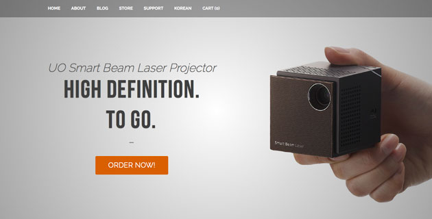
UO Smart Beam Laser Project utilizes a strong selection of website images that showcase the product, along with engaging imagery and video showing the device in action. One of the elements that makes this image deck work so well is the lack of a defined background, so each photo can be used (and reused) in a number of different ways.
If you don't have your own image library, start building a deck from our set of stock photo options. If you want to create an image deck with your own photos, check out our guides on taking professional website photos and product photography.
3. Use a Common Set of Effects
The design “tricks" that are displayed on your website will eventually become part of your visual brand association. From deep shadows and outlined typography to photos that are always displayed in black and white, these effects can showcase your unique identity.
These visual effects also include the way photos are framed or the types of imagery or typography in your digital materials.
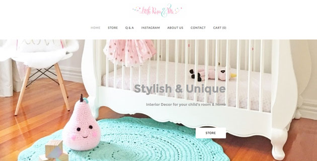
Little Rosie & Me connects colors in the main brand logo to colors in many products and other visual brand elements. While shoppers can buy items in other colors, the showcased product imagery always matches the brand. The theme is carried to Instagram as well, where brand photos are clearly distinguishable.
4. Match Text to Visuals
Words and visuals should convey the same message and emotion. It's a connection that sometimes gets forgotten in visual brand planning. Think of it as a message deck to go with your image deck.
4. Match Text to Visuals
Words and visuals should convey the same message and emotion. It's a connection that sometimes gets forgotten in visual brand planning. Think of it as a message deck to go with your image deck.

Create a set of phrases or paragraphs that will be used consistently for the brand. VSTUDIO uses some of this language right on the homepage.
Your message deck should include:
Now think about your website and brand. What words and images come to mind? Use these concepts, and the tips above, as a way to start building your own visual brand.
Your message deck should include:
- Mission statement
- Brand description for footers and press releases
- Short description for social media
- Main messaging for homepage
- Secondary messaging for other important pages (like about pages or blog sidebar)
- Call-to-action language
- Tone and style so that messaging feels like it always comes from the same voice
Now think about your website and brand. What words and images come to mind? Use these concepts, and the tips above, as a way to start building your own visual brand.